31 Nano Banana Pro Prompts You Can Copy, Grouped by the Job You're Doing
By Daniel Riley · Published
In short: The best Nano Banana Pro prompts are plain sentences that describe the shot the way a photographer would be briefed, including any text exactly as it should appear. This library has 31 copy-paste prompts grouped by the job at hand, each with an aspect ratio and a line on why it works. Run any of them in PromptWise alongside 40+ other image, video and audio models.
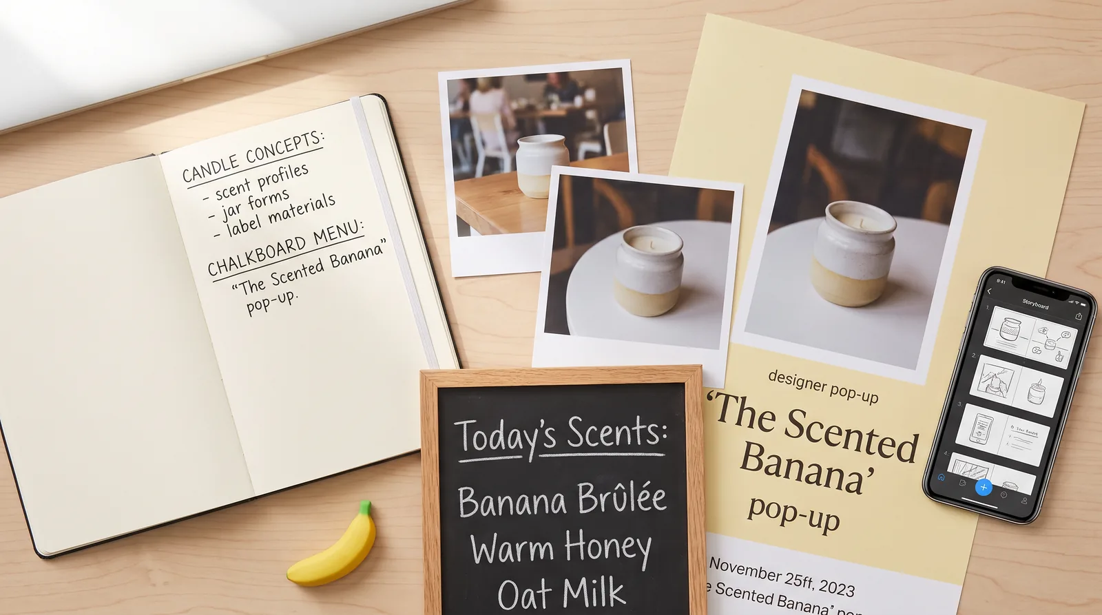
Most prompt lists for Nano Banana Pro are really just prompt lists for any image model with the name swapped in, which is a shame, because Google’s model is good at a few things that most image models still fumble. It can spell. It can take a photo you already have and change one thing about it without quietly redrawing everything else. It can hold on to a face across several scenes, and it is happy to lay out a poster, a menu or a storyboard as if somebody had briefed a designer. A prompt that ignores all of that gets you a perfectly nice picture and leaves most of what the model can do sitting unused.
So this library is organised around jobs rather than styles. There are 31 prompts, grouped into product shots, people and consistent characters, text and posters, edits to photos you upload, ad creatives, thumbnails, and storyboard frames that you can animate afterwards in Kling 3.0 or Seedance 2.5. Each one comes with the aspect ratio it was written for and a line on why it works, so that when you swap in your own product or your own words, you know which bits are holding the image together and which bits you can change as much as you like.
Everything here is written as plain sentences, the way you’d describe a shot to a photographer over the phone, because that is how Google itself says Nano Banana Pro should be prompted. Copy them as they are, run them in PromptWise, then make them yours.
How this library fits with the other guides
There’s already a long guide on this blog to writing AI image prompts that actually work, which covers the general craft (lenses, lighting, composition, colour and so on) and works for any model. If prompting in general is new to you, it’s the better place to start, and nothing below repeats it. Product photographers will get more out of the full guide to AI product photography, which goes deep on lighting setups, multi-angle sets and keeping a catalogue consistent. And if what you really want to know is what Nano Banana Pro costs and how to switch it on in the app, the Nano Banana Pro model page answers that in about two minutes.
This post sits between those. It’s narrower and more practical: prompts that lean on what Nano Banana Pro specifically does well, with just enough explanation to make them reusable. Think of it as the drawer of templates you open on a busy Tuesday, rather than the textbook.
How Nano Banana Pro reads a prompt
Google’s own advice for Nano Banana Pro (published with the launch in November 2025; developers know the model as Gemini 3 Pro Image) boils down to describing five things: the subject, the composition, the action, the location and the style. Who or what is in the picture, how it’s framed, what’s happening, where it’s happening and what it should look like. On top of that, Google suggests adding the details a cinematographer would care about, such as the camera angle, the depth of field, where the light is coming from and how the colours are graded, and stating the aspect ratio if the shape of the image matters.
The more useful part of the advice, though, is about tone rather than ingredients. Google Cloud’s prompting guide for Nano Banana says a list of keywords “won’t cut it” when you’re starting from a blank canvas and that you should describe the scene as a story instead. That’s why every prompt below reads like a paragraph from a brief and not like a row of tags separated by commas. Nano Banana Pro is built on Gemini 3 Pro, so it reads your sentence the way a language model reads anything, and a sentence such as “the jar sits a little below the centre with plenty of space above it” carries information (position, purpose, breathing room) that the tag “centred composition” simply doesn’t.
When you attach images, the shape of the prompt changes. Google’s formula for that case is three parts: say what the reference images are, say how they relate to what you want, then describe the new scenario. Its own example uses a napkin sketch as the structure and a fabric swatch as the texture, then asks for an armchair in a sunlit living room. The library uses the same pattern every time a prompt starts with “Using the attached…” and it’s worth copying even when you write your own, because a reference with no stated job is a reference the model has to guess about.
Five habits behind every prompt in this list
You’ll spot the same handful of habits repeating across the library. None of them is clever on its own, but together they’re most of the difference between a first attempt that’s close and one that’s nowhere near.
Put exact text in quotes and describe how it looks. Google’s tip is to “clearly state what text should appear and how it should look”, and its example is a headline in bold, white, sans-serif type at the top of the frame. If you want words in the image, write them out word for word inside quotation marks, then say what kind of lettering it is (condensed, hand-cut, chunky serif, chalk) and where it sits.
Give every reference image a job. Google suggests labelling them plainly, along the lines of using one image for the pose, another for the art style and a third for the background. Nano Banana Pro can take a lot of references at once (in PromptWise you can attach up to 10 uploaded or library images to a single generation), and the more you attach, the more it matters that each one has a clear role.
Say what you want rather than what you don’t. Google Cloud’s guide recommends positive framing, for example “empty street” instead of “no cars”. Negatives tend to put the very thing you’re trying to avoid into the model’s head, so the prompts below describe the scene you do want and leave the rest out.
Choose the shape before you write. Google lists the aspect ratio among the first things to define, and it really does change the picture: a 9:16 frame and a 16:9 frame of the same scene need different compositions, not just different crops. Every prompt here has the ratio it was written for, and you set it in the picker before you press Generate.
Iterate in small steps. Google describes follow-up prompts as the way to refine an image, and the habit that pays off most is changing one thing at a time. If the light is wrong, fix the light and leave the rest. If you change three things at once and the result gets better, you’ll never know which change did it.
Product shots
Product work is where Nano Banana Pro earns its keep for most shops, mainly because it can read and reproduce a label, which used to be the point where AI product shots fell apart. These five prompts cover the shots a small brand actually needs: a hero image, the real product in a new place, a seasonal refresh, a packaging mockup and a flat layout of a whole kit.
1. A hero shot with the label spelled out
Aspect ratio: 4:5
Prompt
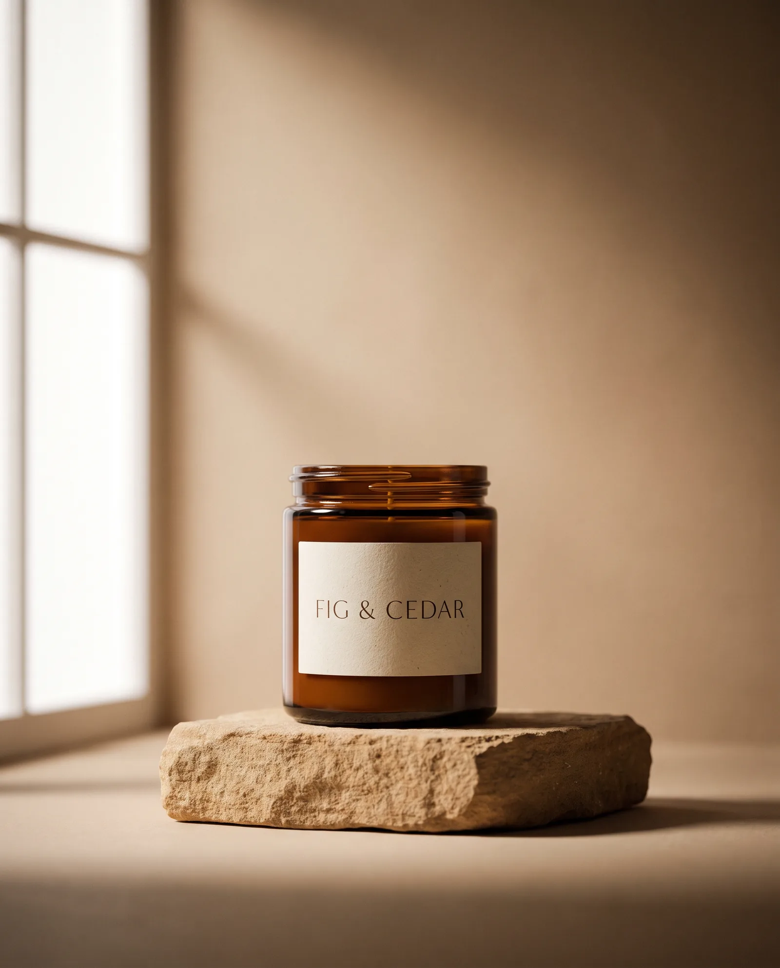
A studio photograph of a small amber glass candle jar with a cream paper label that reads "FIG & CEDAR" in thin serif capitals, standing on a rough sandstone plinth. Soft light comes from a large window on the left, a gentle shadow falls to the right, and the warm beige backdrop gets slightly darker towards the edges. The jar sits a little below the centre of the frame with plenty of space above it. Shot on a 100mm macro lens, with crisp focus on the label.Why it works: The label text is in quotes and the font is described, which gives Nano Banana Pro’s text rendering something exact to aim at, and the empty space above the jar is where your headline will go later.
2. Your own product in a new location
Aspect ratio: 1:1
Prompt
Using the attached photo of the trainer as the product, place it on a wet concrete basketball court at dusk, with puddles reflecting orange streetlights and a chain-link fence softly out of focus behind it. Keep the shape, stitching, colours and logo of the trainer exactly as they are in the photo. Low angle, close to the ground, as if the camera were resting on the court.Why it works: It follows Google’s formula for reference prompts (what the image is, what to do with it, the new scene) and says plainly which details are not allowed to change.
3. The same product in a different season
Aspect ratio: 4:5
Prompt
Using the attached photo of the tea tin as the product, set it on a scrubbed pine kitchen table on a winter morning, next to a knitted tea cosy and a half-eaten slice of toast, with a frosted window behind. Pale, low sunlight comes through the glass. Keep the tin's label, shape and colours unchanged. Cosy and unhurried, with a little steam rising from a cup.Why it works: Reusing the same “keep the label, shape and colours unchanged” sentence for every season is what keeps a catalogue looking like one brand rather than four.
4. A pattern wrapped onto packaging
Aspect ratio: 1:1
Prompt
Take the attached repeating pattern of lemons and leaves and wrap it around a matte cardboard gift box and a folded paper carrier bag, both standing on a pale stone surface. The pattern should follow the folds and edges naturally. Soft daylight, a faint shadow under each item, and a clean, bright, editorial packaging mockup look.Why it works: Google names draping patterns and artwork onto objects as one of the things Nano Banana Pro was built for, so this is playing to its strengths rather than hoping.
5. A neat knolling layout
Aspect ratio: 3:2
Prompt
An overhead knolling photograph of everything in a camping coffee kit, laid out neatly at right angles on a dark green canvas groundsheet: a small hand grinder, an enamel mug, a folding dripper, a bag of beans and a brass spoon. Even, shadowless light from above. Every item is fully visible, with a little space around each one.Why it works: It gives the model the arrangement rule (right angles, space around everything) instead of just a list of objects, and the rule is what makes knolling look deliberate.
A small tip on the first two prompts: if you have a real photo of the product, use the reference version (prompt 2) rather than describing it from scratch. Describing a product in words gets you something that looks like your product’s cousin, while a reference with a “keep it exactly as it is” instruction gets you much closer to the thing you actually sell.
People and consistent characters
People ask about keeping a character consistent more than anything else. Google is honest about it too: its list of current limitations says consistency across edits “may vary”. The approach that helps most is to show the model the person rather than asking it to remember them. Make the character once, save the image, and attach it whenever they need to appear again.
6. A character sheet to reuse later
Aspect ratio: 16:9
Prompt
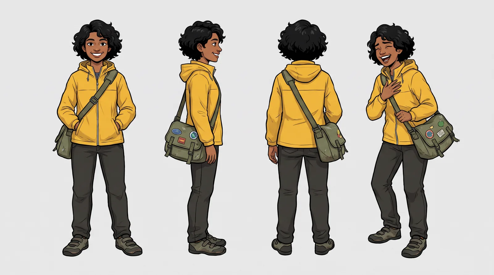
A character reference sheet for a cheerful cycle courier called Priya, in her late twenties, with short curly black hair, a yellow waterproof jacket and a scuffed green messenger bag. Show her four times in a row against a plain light grey background: facing the camera, in profile, from behind, and mid-laugh in a three-quarter view. Same outfit, same proportions and same face in every pose. Clean, even studio light.Why it works: Drawing the character once, from several angles, gives you a single image to attach as the reference for every scene that comes after, which is far more reliable than re-describing her hair every time.
7. The same character in a new scene
Aspect ratio: 9:16
Prompt
Using the attached character sheet of Priya as the reference for her face, hair and clothes, show her locking her bike to a railing outside a busy bakery on a rainy London morning. She is glancing over her shoulder with a half-smile. Overcast light, wet pavement and a shallow depth of field. Keep her exactly as she appears in the sheet.Why it works: There’s one reference and it has one clearly stated job, which is pretty much exactly how Google suggests you handle an uploaded image.
8. A group of real people in one shot
Aspect ratio: 3:2
Prompt
Put the four people in the attached photos together at one long table in a candlelit Italian restaurant, mid-toast, with their glasses raised. Each person keeps their own face, hair and clothing from their photo, and they can be seen from slightly different angles, as feels natural around a table. Warm tungsten light, a few out-of-focus diners behind them, relaxed and happy.Why it works: Google says Nano Banana Pro can keep up to five people consistent, and its own group example also lets the model show people from different angles, which stops everyone looking like they’re posing for a passport photo.
9. A headshot from a casual selfie
Aspect ratio: 4:5
Prompt
Using the attached selfie, create a professional headshot of the same person against a deep teal backdrop, wearing a simple charcoal crew-neck jumper. Keep their face, hairstyle and expression recognisably the same. Soft key light from the front left, a faint rim of light on the hair, and sharp focus on the eyes.Why it works: In one sentence it changes the context (the backdrop, the jumper, the light) and protects the identity, so the model knows exactly what’s up for grabs and what isn’t.
10. A mascot in six poses
Aspect ratio: 3:2
Prompt
A friendly hand-drawn mascot for a bakery: a round sourdough loaf with small arms and legs, a flour-dusted face and a red neckerchief. Show it six times on a white background in a two-by-three grid: waving, carrying a baguette, sleeping, jumping, holding a coffee cup and giving a thumbs up. Thick ink outlines, flat warm colours and an identical design in every pose.Why it works: Because all six poses are in one image, they come out of the same generation, so there’s only one version of the design to keep track of instead of six slightly different loaves.
Say you run a small courier business and want the same rider in every Instagram post for a year. Prompts 6 and 7 are the ones to save. You make the character sheet once, and after that every new scene is a short prompt plus that one image, which is much easier than describing her face in words each time and hoping it comes out the same.
Text in images, posters and logos
This is the section where Nano Banana Pro pulls furthest away from the image models of a couple of years ago, when asking for a word in a picture usually got you something that looked like a language from another planet. Google now calls it “the best model for creating images with correctly rendered and legible text”, anything from a short tagline to a long paragraph, and the launch examples include posters, calligraphy and packaging translated into Korean. Google’s own prompting tips still admit that small text and exact spellings “may not work perfectly”, though, so the prompts below keep the words short, and you should always read them back.
11. A screen-printed event poster
Aspect ratio: 2:3
Prompt
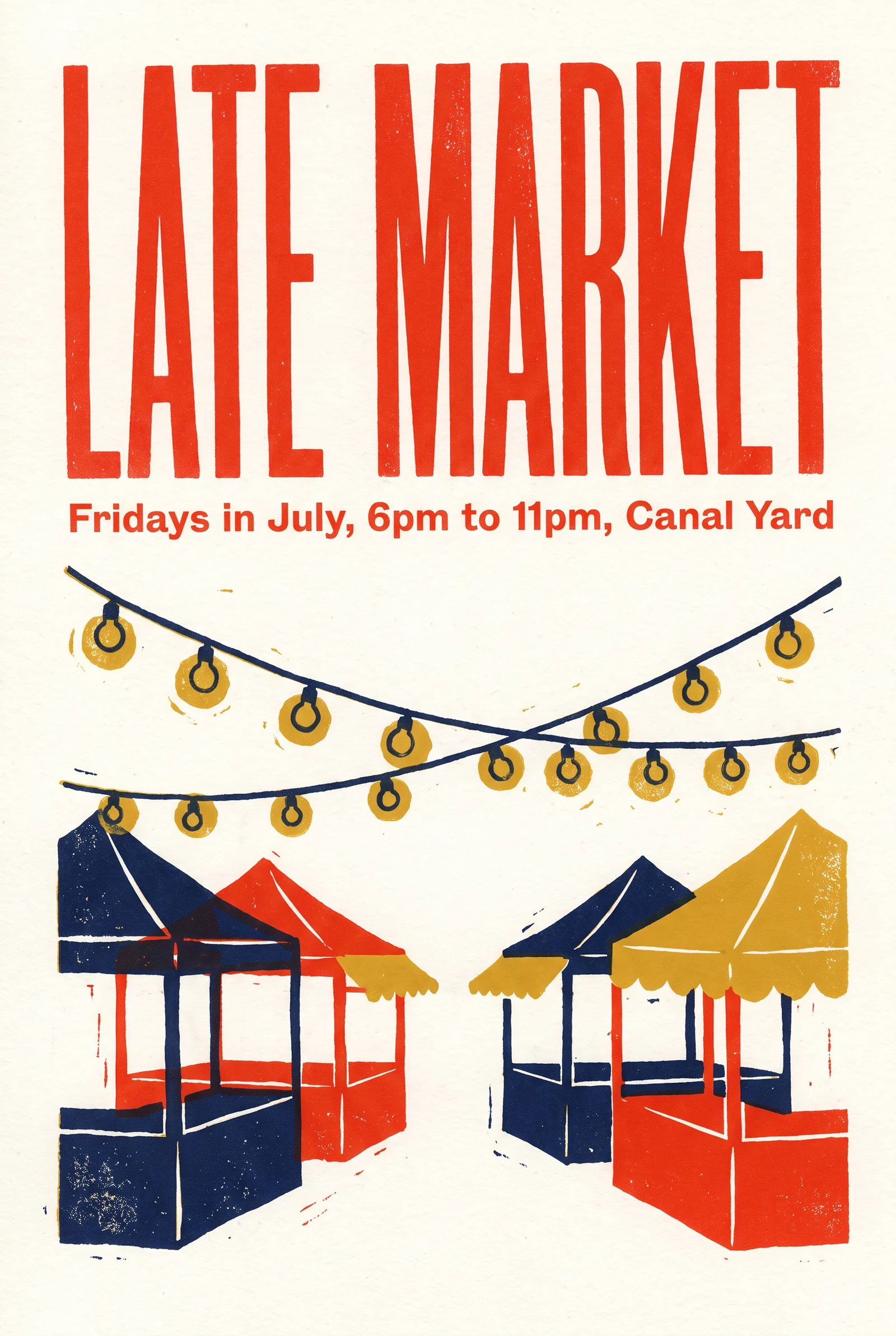
A screen-printed poster for a summer night market. The words "LATE MARKET" run across the top in tall, condensed, hand-cut letters in tomato red, and underneath, in small clean capitals, "Fridays in July, 6pm to 11pm, Canal Yard". The middle of the poster shows a simple illustration of string lights over market stalls. Off-white paper texture and three colours only: tomato red, navy and mustard.Why it works: Every word that’s meant to appear is sitting inside quotes with a note on how it should look, and limiting it to three colours is what makes the result feel like an actual screen print rather than something knocked up on a laptop.
12. A hand-lettered café menu
Aspect ratio: 3:4
Prompt
A café chalkboard menu photographed straight on, hanging on a whitewashed brick wall. Hand-lettered in white chalk, it reads "TODAY" at the top, with three lines underneath: "Flat white 3.20", "Cardamom bun 3.50" and "Soup and bread 6.00". Small doodles of a cup and a bun in the corners, a little chalk dust, soft daylight.Why it works: It’s short on purpose. Google admits small text and longer passages are where spelling still slips, so a menu with a heading and three lines gives the model far less room to go wrong than a whole board of prices would.
13. A step-by-step infographic
Aspect ratio: 4:5
Prompt
A clean infographic titled "How to brew pour-over coffee" in bold sans-serif at the top, with five numbered steps in a vertical column: rinse the paper filter, add 15g of ground coffee, pour 50ml of water and wait 30 seconds, pour slowly up to 250ml, then serve. Each step has a small flat illustration on its left. Cream background, dark brown text and copper as the only accent colour.Why it works: The steps are written into the prompt rather than left to the model, which is the safe way to use its world knowledge for anything someone will actually follow in their kitchen at seven in the morning.
14. Translating a label
Aspect ratio: 1:1
Prompt
Translate all the English text on the attached bottle label into Spanish, keeping the font, layout, colours and everything else in the image exactly the same.Why it works: It borrows the shape of Google’s own translation example, with one clear job and an explicit instruction to leave everything else alone, which matters a lot on packaging where the layout has already been signed off.
15. A wordmark logo
Aspect ratio: 1:1
Prompt
A bold logo for a bike repair shop called "Spoke & Chain", with the words set in a heavy rounded sans-serif and the ampersand drawn as a small bicycle chain link. Flat vector style, black on a plain white background with nothing else in the frame.Why it works: One clever idea, the chain-link ampersand, is plenty for a logo; ask for three or four visual puns at once and they tend to come back fighting each other for space.
Before anything here goes to a printer, zoom right in and read every word, out loud if it helps. A misspelt price on a menu is the kind of thing nobody notices on a laptop screen and every single customer notices on the wall, and Google is clear that anything data-driven, like the coffee infographic, should be checked for accuracy as well.
Editing a photo you upload
Most people already have a camera roll full of photos that are nearly right, which is why editing is such a useful part of Nano Banana Pro. Google’s advice for edits is to be “direct and specific”, with examples like changing a man’s tie to green or removing a car from the background. Its launch post also shows a scene changed from day to night, the focus moved onto some flowers, and an image changed to a new aspect ratio. In PromptWise there’s no separate edit mode or mask: you upload the photo, attach it as a reference and describe the edit in the prompt. That makes it a fresh render that follows your instruction, not a pixel-perfect retouch, so check faces, labels and fine detail afterwards. All of the prompts below assume you’ve attached the photo you want to edit.
16. Day into night
Aspect ratio: Same as the original
Prompt
Turn this scene into a clear night, with warm light glowing from the windows, the street lamps switched on and a deep blue sky. Keep the buildings, cars and people exactly where they are.Why it works: Google shows off Nano Banana Pro’s lighting controls with almost exactly this edit, and the second sentence is there to stop it redrawing the whole street while it’s at it.
17. Removing something from a photo
Aspect ratio: Same as the original
Prompt
Remove the bin and the parked scooter on the left of the photo and fill the space with the same brick wall and pavement that surround them. Leave everything else untouched.Why it works: It names what goes, says what should fill the gap and fences off the rest of the picture, so there’s nothing left for the model to guess about.
18. Changing one detail
Aspect ratio: Same as the original
Prompt
Change the sofa to a deep forest green velvet, keeping its shape, the cushions, the shadows and the rest of the room exactly as they are.Why it works: Direct and specific, as Google puts it, and making one change per prompt means that when you put the two versions side by side you know exactly what moved.
19. Reshaping a photo for stories
Aspect ratio: 9:16
Prompt
Change the aspect ratio to 9:16 by extending the sky above and the beach below, keeping the couple and the dog exactly where they are and at the same size.Why it works: Telling the model where the new space should come from (more sky, more sand) is the difference between a natural-looking extension and a couple who’ve been quietly stretched.
20. Relighting a portrait
Aspect ratio: Same as the original
Prompt
Relight this portrait as if a single warm lamp were placed low and to the right of the person, casting soft shadows up across the left side of their face. Keep their features, expression and clothes exactly the same, and darken the background slightly.Why it works: It describes where the light physically comes from rather than naming a mood, which gives the model something concrete to follow.
Each edit prompt has two parts, the change you want and a sentence that protects everything else. If you leave the second part out, the model may change parts of the photo you were happy with. That doesn’t matter much for a mood board, but it’s a real problem for the main photo on a product page.
Ad creatives
Ads are really a mix of everything above: a product, a person or two, some words and a strict sense of where things go. Google says Nano Banana Pro can apply a brand’s look consistently across mockups and other surfaces, and these four prompts take an idea from a single feed ad through to a story, a billboard and a scrappier, more casual version.
21. A social ad with a headline
Aspect ratio: 4:5
Prompt
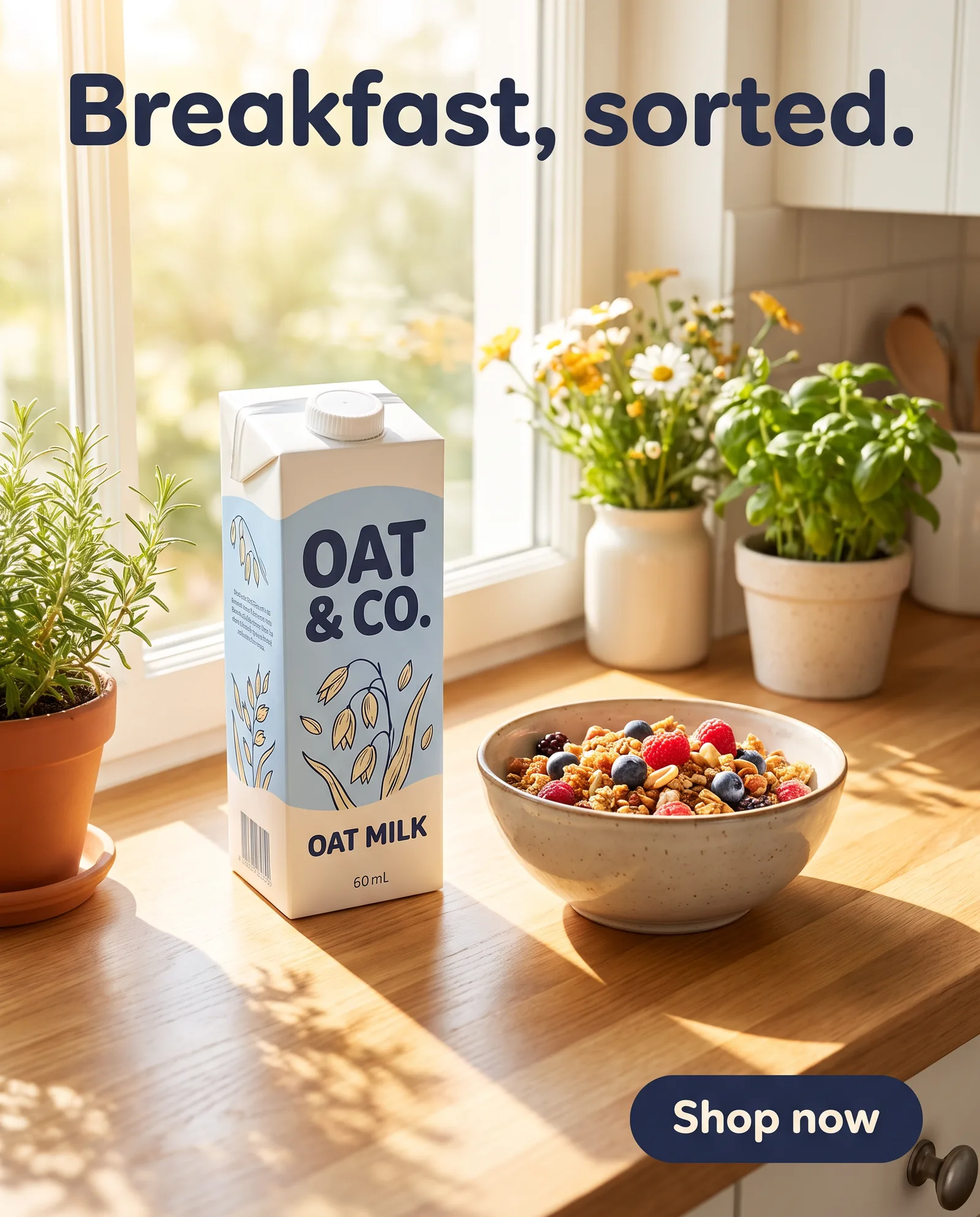
A bright social media ad for an oat milk brand. A carton of oat milk with a pale blue label stands on a sunny kitchen windowsill next to a bowl of granola. At the top, the headline "Breakfast, sorted." in a friendly rounded sans-serif, in dark navy. At the bottom right, a small rounded button shape that says "Shop now". Clean, cheerful and full of daylight.Why it works: The layout is described the way a designer would brief it (headline at the top, button bottom right), so the text lands where an ad needs it.
22. The same ad as a story
Aspect ratio: 9:16
Prompt
Recreate the attached ad as a vertical 9:16 story, keeping the product, the headline and the colours the same, and moving the headline into the top third so it sits clear of the profile icons.Why it works: Resizing is where most ad sets fall apart, and this prompt keeps the creative identical while fixing the one thing that changes between placements.
23. A billboard mockup
Aspect ratio: 16:9
Prompt
A photograph of a large roadside billboard at golden hour, seen at a slight angle and showing the attached ad design. The billboard sits above a row of shops on a busy high street, with a red double-decker bus passing below. Natural reflections and a little weathering on the billboard frame.Why it works: The ad becomes one object in a real-looking scene, which is the kind of brand mockup Google describes the model being made for.
24. An unpolished phone-photo ad
Aspect ratio: 9:16
Prompt
A candid phone photo of a desk at home, showing a small ceramic plant pot with a trailing pothos next to an open laptop and a half-drunk mug of tea. Slightly tilted framing, afternoon light, a little clutter, believable and unpolished. Leave clear space at the top for a caption.Why it works: Asking for a tilt and some clutter gets you something that sits naturally in a feed, where a perfect studio shot would look like an ad.
A word on the button in prompt 21: it’s there because a mock button helps the composition look like an ad, but most ad platforms add their own call to action, so you’ll often generate a version without it for the live campaign and keep this one for presentations.
Thumbnails and covers
Thumbnails get very little attention, usually half a second on a phone screen surrounded by lots of others, so they need to be simple. A face with a clear expression, two or three words in big letters, strong contrast and one idea is usually enough. Nano Banana Pro is useful here because it can put the words into the image itself, which saves you adding them afterwards in a separate editing app.
25. A YouTube thumbnail
Aspect ratio: 16:9
Prompt
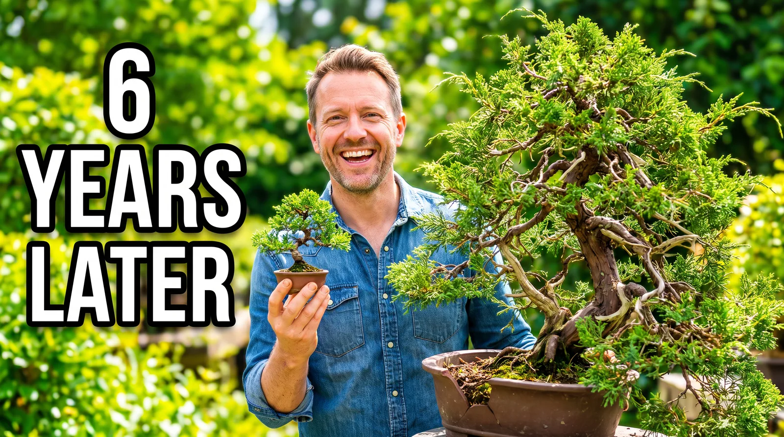
A YouTube thumbnail showing a delighted man in his forties holding up a tiny bonsai tree in one hand, with a huge overgrown version of the same tree beside him. On the left side, the words "6 YEARS LATER" are written in thick white letters with a black outline. The image is bright and high in contrast, with saturated greens and a blurred garden in the background.Why it works: The text is only three words and it sits on the side of the frame with nothing behind it, so it can still be read when the thumbnail is shown at phone size.
26. A podcast cover
Aspect ratio: 1:1
Prompt
A square cover for a podcast called "Small Kitchens". The title runs across the middle in large, chunky serif letters that feel a little playful. Behind it is an overhead photo of a tiny, tidy galley kitchen counter with a chopping board, a tomato and a knife on it. The colours are warm terracotta and cream, and the title should still be readable when the cover is very small.Why it works: Adding “readable when the cover is very small” tends to get you bigger letters and less detail, and that’s what you want for a cover that will mostly be seen as a small square in a podcast app.
27. A lesson thumbnail
Aspect ratio: 16:9
Prompt
A simple thumbnail for an online lesson about looking after houseplants. A monstera in a terracotta pot sits on the right, and the words "Lesson 3: Watering" are on the left in a plain bold sans-serif. The background is a soft sage green, and the whole thing feels flat, friendly and uncluttered.Why it works: If you keep the layout and colours the same and only change the lesson title each week, all the lessons in the course will look like they belong together.
Storyboard frames to animate in Kling 3.0 and Seedance 2.5
The most underrated use of Nano Banana Pro might be as the very first step of a video. If you’ve read the guide on how to make AI videos, you’ll know the argument for starting from an image: you approve the look as a still, for a couple of credits, before you spend a good deal more on motion. Google’s own launch examples include Nano Banana Pro sketching out a storyboard for a scene, so the library starts there and then builds the actual frames you’d hand over to a video model.
28. A four-panel storyboard
Aspect ratio: 16:9
Prompt
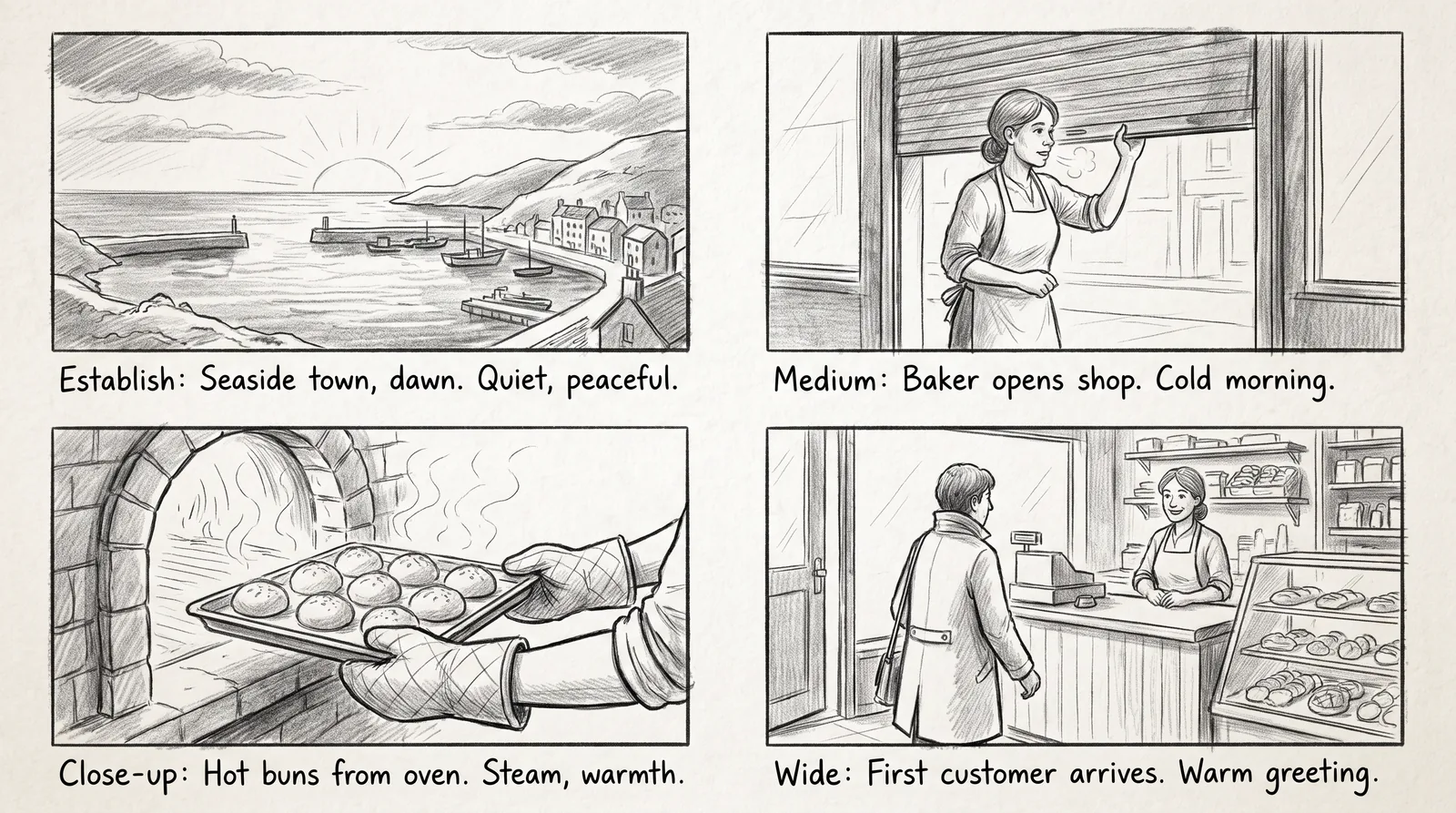
Create a black and white pencil storyboard for a 20-second advert, drawn as four panels in a row. The first panel is an establishing shot of a seaside town at dawn, the second is a medium shot of a baker opening her shop shutter, the third is a close-up of her hands pulling a tray of buns from the oven, and the last is a wide shot of the first customer walking in. Under each panel there's a short handwritten note describing the shot.Why it works: Google shows Nano Banana Pro turning a scene into a storyboard, and having the whole advert on one page makes it easy to spot the weak shot before you spend any credits animating it.
29. A start frame for Kling 3.0
Aspect ratio: 16:9
Prompt
A cinematic still of a baker in her fifties pulling up the metal shutter of her little seaside bakery at dawn, seen from the other side of a cobbled street. The sky is pale pink, the sea is just visible at the end of the street, and warm light is spilling out of the shop. It's shot on a 35mm lens at eye level, with room on both sides of her for the camera to move.Why it works: Leaving room on both sides of the baker gives the video model somewhere to take the camera, rather than handing it a frame that’s already cramped.
30. A vertical start frame for Seedance 2.5
Aspect ratio: 9:16
Prompt
A close-up still of flour-dusted hands lifting a tray of glossy cinnamon buns out of an old black oven, with steam curling up into warm light from the window. The bakery shelves are soft and out of focus behind. It's a vertical frame, and the tray sits in the lower half so there's room above it for the steam to rise.Why it works: It’s composed for the movement that comes next, with the tray low in the frame because the steam needs somewhere to go once things start moving.
31. A matching end frame
Aspect ratio: 16:9
Prompt
Using the attached frame of the bakery as the reference for the street, the light and the colours, show the same street an hour later in full sunshine. The shutter is fully open, there's a chalkboard on the pavement, and a man in a navy coat is stepping inside. Keep the same camera position and the same lens.Why it works: Locking the camera position and pointing the reference at the start frame gives you a matching pair that a video model can travel between, from dawn to the first customer.
Once you’ve got the frames, which video model to use depends on the shot. Kuaishou’s own user guide says Kling 3.0 supports start and end frames, which makes it a natural home for prompts 29 and 31 as a pair, and it’s the one to reach for when a face or a shop sign has to stay sharp all the way through. Seedance 2.5 can run up to 30 seconds in a single generation and makes the sound along with the picture, so a vertical clip like prompt 30 suits it nicely if you want the steam, the creak of the oven door and the bustle of the shop all in one go. There’s a much longer look at that choice in the Seedance vs Kling vs Veo comparison, which runs one set of test prompts across all three.
Text to video or image to video, then? For anything involving a product, a recurring character or a specific place, start from an image every time. Text to video is fine for quick ideas and abstract moods, but a frame you’ve already signed off takes most of the guesswork out of the clip.
Where Nano Banana Pro still trips up
Google is refreshingly upfront about where Nano Banana Pro still struggles, and it publishes the list right next to its prompting tips, which is more than most model makers bother to do. Small text, fine details and exact spellings “may not work perfectly”. Diagrams and infographics need their facts checking. Translations can come back with the grammar slightly off, or miss a cultural nuance that a local would spot instantly. Complicated edits, like blending several images together or relighting a whole scene, can leave odd artefacts behind, and characters can drift a little from one edit to the next.
None of that is a reason to steer clear of the model, but it is a good reason to build a few checks into the way you work. Picture a bakery owner printing two hundred flyers off the back of prompt 11 and only noticing on the doormat the next morning that “Fridays” has picked up an extra letter; that’s the sort of mistake a thirty-second read-through would have caught. So keep text short and read it back, write the facts into the prompt yourself (the way prompt 13 spells out the brewing steps rather than trusting the model to know them), get a fluent speaker to look over anything translated before it goes anywhere near packaging, and keep a reference image of every recurring character to hand, because a picture is something the model can hold on to in a way a paragraph of description isn’t.
What these prompts cost in credits
There’s no separate charge for Nano Banana Pro in PromptWise; every plan includes every model, and each generation simply uses credits. Starter is $19 a month for 275 credits, Plus $39 for 800, Pro $79 for 1,800 and Max $149 for 3,800, with Max 2 ($249, 6,500 credits) and Max 3 ($349, 9,500 credits) above that if you’re producing at volume. What a Nano Banana Pro image costs at each size is on PromptWise’s pricing page.
It’s tempting to plan on running each of the 31 prompts here once, at the standard settings of 1:1, 1K and a single image, but real life is messier than that. You’ll run the poster four times because the lettering wasn’t quite right, and you’ll want the hero shot at a bigger size. The Generate button shows the exact number before you press it, though, so you’re never guessing. Credits refresh every billing month and unused ones don’t roll over, and if a generation fails, its credits are refunded automatically.
If you’d rather explore an idea before committing to the final version, Nano Banana 2 and Nano Banana 2 Lite sit in the same menu (the app calls them its flash-speed and fastest Gemini image models), and you can switch back to Nano Banana Pro once you like where things are going. Every plan is laid out on the models and pricing page.
Frequently asked questions
What should a Nano Banana Pro prompt include?
Google suggests covering the subject, the composition, the action, the location and the style, then adding camera, lighting and aspect ratio details when you want more control. Write it as a description in full sentences rather than a list of keywords, and put any words that should appear in the image inside quotation marks.
How do I get Nano Banana Pro to spell words correctly?
Write the exact words in quotes, describe the lettering and say where it goes. Keep text short, because Google says small text and exact spellings may not always come out perfectly, and always read the result before you publish or print it.
How many reference images can Nano Banana Pro use?
Up to 10 per generation in PromptWise, from your uploads or your library. Google’s own figure for keeping people recognisable is five. More references aren’t always better: say in the prompt what each image is for, whether that’s the product, the character or the style to copy.
How do I edit part of a photo without changing the rest?
Attach the photo, describe the one change you want in plain words, then add a sentence that protects everything else, for example “keep the rest of the room exactly as it is”. Make one change per prompt so you can see exactly what moved.
Can Nano Banana Pro translate the text in an image?
Yes. Google shows it translating the text on product packaging while keeping everything else the same. Translations can still contain grammar mistakes or miss cultural nuances, so have a fluent speaker check them before they go on anything real.
Do these prompts work with Nano Banana 2?
Most of them will run on Nano Banana 2 and Nano Banana 2 Lite in PromptWise too, which makes those two handy for testing ideas quickly, although Google notes that Lite isn’t built for several reference images or step-by-step editing. For the final image, and especially for anything with text or references, switch back to Nano Banana Pro.
Should I write Nano Banana Pro prompts as sentences or keywords?
Sentences. Google’s own guide says a list of keywords won’t cut it for a scene built from scratch and recommends describing it like a story, which is how every prompt in this library is written.
Make the library yours
The fastest way to get value from this list is to pick the three prompts closest to your next real job, swap in your own product, people and words, and run them today. Keep the structure and change the details: the label line, the reference sentence, the “keep everything else the same” sentence. Those are what do the work. When a prompt gives you something you like, save it somewhere you’ll find it again, because a small library of prompts you trust is worth far more than a big folder of ones you’ve never tried.
Sources
We checked these official pages on the dates shown. Prices and specs can change, so check the provider's page before you buy.
- Google: Nano Banana Pro launch announcement (Checked 24 Oct 2026)
- Google: Nano Banana Pro prompting tips (Checked 24 Oct 2026)
- Google Cloud: Nano Banana prompting guide (Checked 24 Oct 2026)
- Gemini API docs: image generation (Checked 24 Oct 2026)
- Kling AI: Kling 3.0 user guide (Checked 24 Oct 2026)
- ByteDance Seed: Seedance 2.5 launch announcement (Checked 24 Oct 2026)